I harvested the opinions online, through Facebook, forums and via e-mail so most have come from people I know in one capacity or another. Views on meaning are varied but some were surprisingly accurate. I gathered views from people who have no creative background as well as those with more experience. Only one person so far has been unable to elicit any real meaning from the animations. Some people thought that the animations were some kind of commentary on environmental issues, most likely because of the tree image at the beginning.
The following are the comments I have received so far, red text is my response to the comment:
From Facebook:
- Well they were different and very relaxing to watch, but I think they lack substance and/or subject. If you know what I mean. (So you would prefer something a little more figurative, maybe with character to relate to?) Maybe a character or an object. I think it needs to tell a story or several different stories, perhaps the viewer could see a number of different stories depending on there imagination.
- love them jules. i like ego 2 best. the reds set it off. i'd like to see more 'lumpiness' maybe throw in some texture like sand or butter or something. as for what it means, i dont think that deep, i see only 'cool' and 'awesome'.
- They do have a Rorschach test quality to them. Not 100% abstract but abstract enough to have people read into them what they were thinking about anyway.
- Ego1:
- When it ended with two people holding hands and they were no longer being crushed by the world around them. That made me feel all optimistic. Ego2: It made think about reproduction lessons in biology at school. That made me feel slightly squeamish because I'd rather think that people are made of chocolate sponge cake than all that icky blood and stuff.
- Ergo2: Relationships. Starting off as one and then splitting into two. Growth/Development.
- Wow, Julie, have had to watch at the second one a few times as I got lost in the aesthetics, beautiful. The two sides of self(but maybe I thought this because of the title too), growth, the harshness and loss of growing up, moving on, that all sounds a bit sad, just before the end it seemed to have a feeling of positivity and bringing those things together (about 1.16)
- Breathtaking , Look forward to seeing on the big screen!
- ego 2 made me think of dissection. looking inside and division. self searching. bloodshed. murder. love it.
- Ego 1 It made me think of birth - rebirth. I felt like the page was about to set on fire. It also made me think of something trying to escape. It made me feel a bit scatty and nervous. Ego 2 It made me think of the deterioration of the environment - the red made me think of murder - it made me feel slighty unconfortable.
- Ego 1 - It looked like a disease/mould growing in a petri dish. When the two humans emerged from it, it either meant we all come from bacteria or we're parasites on the earth. The colours were quite dark so it didn't make me feel very good. Ego 2 - I liked the opening which looked like a tree, then splitting open it looked like blood was coming out. I thought it symbolised how we are killing the planet. I liked the colours in this better, although the red was a little disconcerting.
- Looks like a lot of little people spawning and suddenly being devoured by the blob over and over. Kind of harsher looking then the earlier "organic matter on glass" ones since parts look like people or people parts, though perhaps it's from mindset rather then the art itself. The second one has an even stronger vibe of decay, like a helpless human getting run over by a tractor, bleeding out until dead and then slowly molding as microbes and algae take over around the swarms of insects hatching in the flesh. Big vibe of helplessness, filthiness and death. (Yeah, I was going for something a little more hopeful, maybe the red is too dramatic? My work always veers towards darker emotions for some reason. The helplessness part is good but I probably need to make it more positive towards the end.) Doesn't look positive at all to me really, possibly a hint when the humans actually move. The red just looks like arterial blood to me. End of ego2 does have actually still around humans I suppose. The red looks more negative then the green to me, but again it could be part mindset. There is probably a hint of rebirth in the sense that they do respawn continually as they're consumed, hard to say if focusing on the destruction rather then the creation prior to it is just dependent on what the viewer is thinking rather then the animation itself. I realize I reuse the phrase "to me" excessively and for no reason since it's rather obvious anything I say is only my opinion but I don't feel like copy editing it out :-). [EDIT] Watched an earthworm struggling off the porch very slowly and into the ground and looking at the texture, I think the reason the animation looks harsh is the gritty texture. Organic stuff looks hopeful but grit, like the small hard dots do not. Even the things destroying the humans do not really look that negative, the downer vibe is mostly in the hard-looking small particle sprays. Sort of like a ham sandwich with sand in it - a sliced up dead animal is somehow kind of ok, the sand is what you cringe about.
- Well, I can't comment on the actual site, but I watched them and thought they were awesome! I was entertained the whole time watching both.
- Spawning
- Devoured
- Harsher
- Decay
- Helplessness
- Bleeding
- Moulding
- Microbes
- Swarms
- Hatching
- Filthiness
- Death
- Arterial blood
- Negative
- Rebirth
- Respawn
- Consumed
- Destruction
- Creation
- Red
- Awesome
- Relaxing
- Disease/mould growing
- Emerged
- Bacteria
- Parasites
- Dark
- Splitting
- Blood
- Disconcerting
- Struggling
- Optimistic
- Reproduction
- Biology
- Squeamish
- Relationships
- Splitting
- Growth/Development
- Loss of growing up
- Moving on
- Dissection
- Division
- Self searching
- Bloodshed
- Murder
The feedback has helped me to see what some others might read into things. People generally find it quite disturbing, especially the use of red in Ego 2. A lot of the viewers felt that the look was 'biological' (use of words such as; spawning, decay, moulding, microbes, swarms, hatching, blood, rebirth, re-spawn, disease, bacteria, parasites, reproduction, dissection and division) which in a way is what I was aiming for. I like to feel that my work is 'alive', like it is it's own entity.
Much of the feeling about my work looking 'biological' has to do with the technique that I have used. By using mediums that resist one another I have created an environment where parts of the image expand while other parts are eroded. This 'breathing' effect gives the feel that what you are looking at is very much alive and the use of fluid adds to this. I think that the job of an animator is to bring inanimate objects to life but working with these fluids means that to a certain extent they animate themselves, I just manipulate them to create imagery that people can relate to.
Rorschach test
In the feedback Patrik brought up the Rorschach test which is something that I had been thinking about for a while. The Rorschach test comprises of 'inkblot' images that the patient is asked to respond to and was a popular method of psychological testing in the 1940's and 1950's. The viewer is asked to give their immediate interpretations of the images that they are presented with and their responses were used to gain insight into their personality.
Below are some examples of the Rorschach test cards:

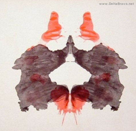

As the inkblot image is abstract the viewer creates their own meaning. There are common answers that people come up with which could mean that the images, although abstract, are suggestive of form. The images that I have created are moving images, which adds another dimension.
This music video is inspired by the inkblot technique, and has the tongue in cheek title of 'Crazy':
The interpretations that I received through feedback are quite interesting. In a way it has helped me to pinpoint the dominant emotions that stand out from the array of feelings that I wanted to depict. I tend to use my negative experiences to fuel my creative work. I often wonder if this is something that has a therapeutic effect or if it is somewhat negative to dwell on those experiences? A few of the people that gave feedback described a struggle of sorts:
"I felt sorry for the person struggling to survive on their own in an environment that keeps trying to crush them."
"The harshness and loss of growing up, moving on."
"Self searching."
"It also made me think of something trying to escape."
"Looks like a lot of little people spawning and suddenly being devoured by the blob over and over."
The period of life that I have in mind is from the age 0f about 8 until now I suppose. The last 7 years haven't been as much of a struggle as my teens and early 20's so I have been trying to express a growing positivity. This is proving to be much more difficult than I had imagined it would be. It has been suggested to me that as I am a person who is fuelled by anxiety and stress, feeding off it as such, that a 'happy ending' would spell an end to what compels me. The feedback has shown me that the focus is still on the negative. The viewer wants to see a happy ending, they want to feel that the protagonist has won the battle. I need to work on how to convince the viewer that all is well by the end.
It could be that the viewer needs to see that the protagonist is helped in some way or that they grow in strength. The negative forces are too dominant and this causes the viewer feels threatened and unnerved. I will attempt to add positivity by adding some vibrant colours. I have brought 3 more pigments; cadmium yellow, cobalt turquoise and phthalocyanine green.

No comments:
Post a Comment